ggplot : 다채롭고 미적인 그래프를 생성할 수 있는 패키지이다.
install.packages('ggplot2')
library(ggplot2)
# ggplot2 패키지 사용함
month <- c(1,2,3,4,5,6)
rain <- c(55,50,45,50,60,70)
df <- data.frame(month,rain)
df
# 막대 그래프 그리기
ggplot(df,aes(x=month,y=rain)) +
geom_bar(stat='identity',width=0.7,fill='blue')

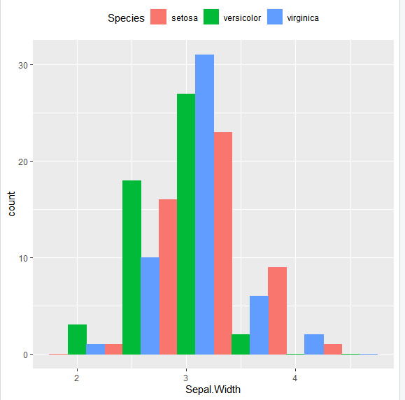
# 히스토그램 그리기
# x = Sepal.Width : 히스토그램의 데이터 Speices 컬럼의 값으로 색상 자동 지정
ggplot(iris,aes(x=Sepal.Width, fill = Species,color=Species)) +
geom_histogram(binwidth=0.5,position='dodge') +
theme(legend.position = 'top')
# 산점도 그리기
# iris의 꽃잎의 길이(Petal.Length), 폭(Petal.Width)의 산점도
ggplot(data=iris,aes(x=Petal.Length,y=Petal.Width,color=Species)) +
geom_point(size=1)

# 상자 그림 그리기
# iris 데이터셋의 꽃잎의 길이(Petal.Length)를 상자그림으로 출력
ggplot(data=iris,aes(y=Petal.Length)) +
geom_boxplot(fill='yellow')

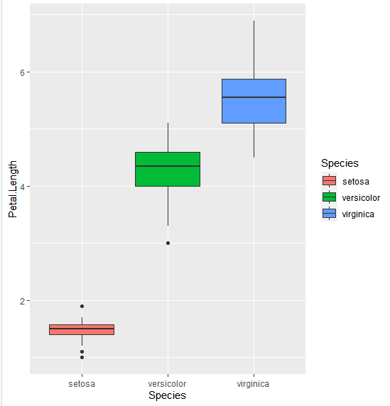
# 다중 상자 그림 그리기
ggplot(data=iris,aes(x=Species, y=Petal.Length, fill=Species)) +
geom_boxplot()
# 품종의 순서를 versicolor, virginica, setosa 순으로 출력
iris2 <- iris
iris2$Speices <- factor(iris2$Species,
levels=c('versicolor','virginica','setosa'))
iris2
ggplot(data=iris2,aes(x=Species,y=Petal.Length,fill=Speices)) +
geom_boxplot()

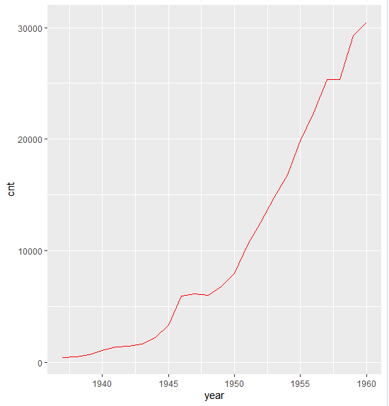
# 선 그래프 그리기
# 1937~1960년 항공기 승객들의 이동거리 통계에 대한 선 그래프 작성
year <- 1937:1960
cnt <- as.vector(airmiles)
df <- data.frame(year,cnt)
df
ggplot(data=df,aes(x=year,y=cnt)) +
geom_line(col='red')
# airquality 데이터 셋의 열은 Ozone,Solar.R,Wind,Temp,Month,Day 정보를 저장함
# 월별 평균 기온 변환을 선 그래프로 출력하기
str(airquality)
head(airquality)
agg <- aggregate(airquality$Temp, by=list(airquality$Month), FUN=mean)
agg[,1]
agg[,2]
colnames(agg) <- c('M','T')
agg
ggplot(data=agg,aes(x=M,y=T)) +
geom_line(col='red')

# 월별 오존 농도의 범위를 상자그림으로 비교합니다.
# 상자 그래프에서 그룹에 해당하는 데이터의 타입은 factor 형이어야함
str(airquality)
ggplot(data=airquality,aes(x=factor(Month),y=Ozone,fill=factor(Month))) +
geom_boxplot()

# 제목추가하기
+ ggtitle('제목명') +
theme(plot.title=element_text(size=25,face='bold',colour='steelblue'))
'R' 카테고리의 다른 글
| R - 지도 시각화 (1) | 2021.06.03 |
|---|---|
| R - Word Cloud (0) | 2021.06.03 |
| R - 방사형 차트(radar chart) (0) | 2021.06.01 |
| R - treemap (나무지도) (0) | 2021.06.01 |
| R - 조합, 집계 (0) | 2021.05.31 |


